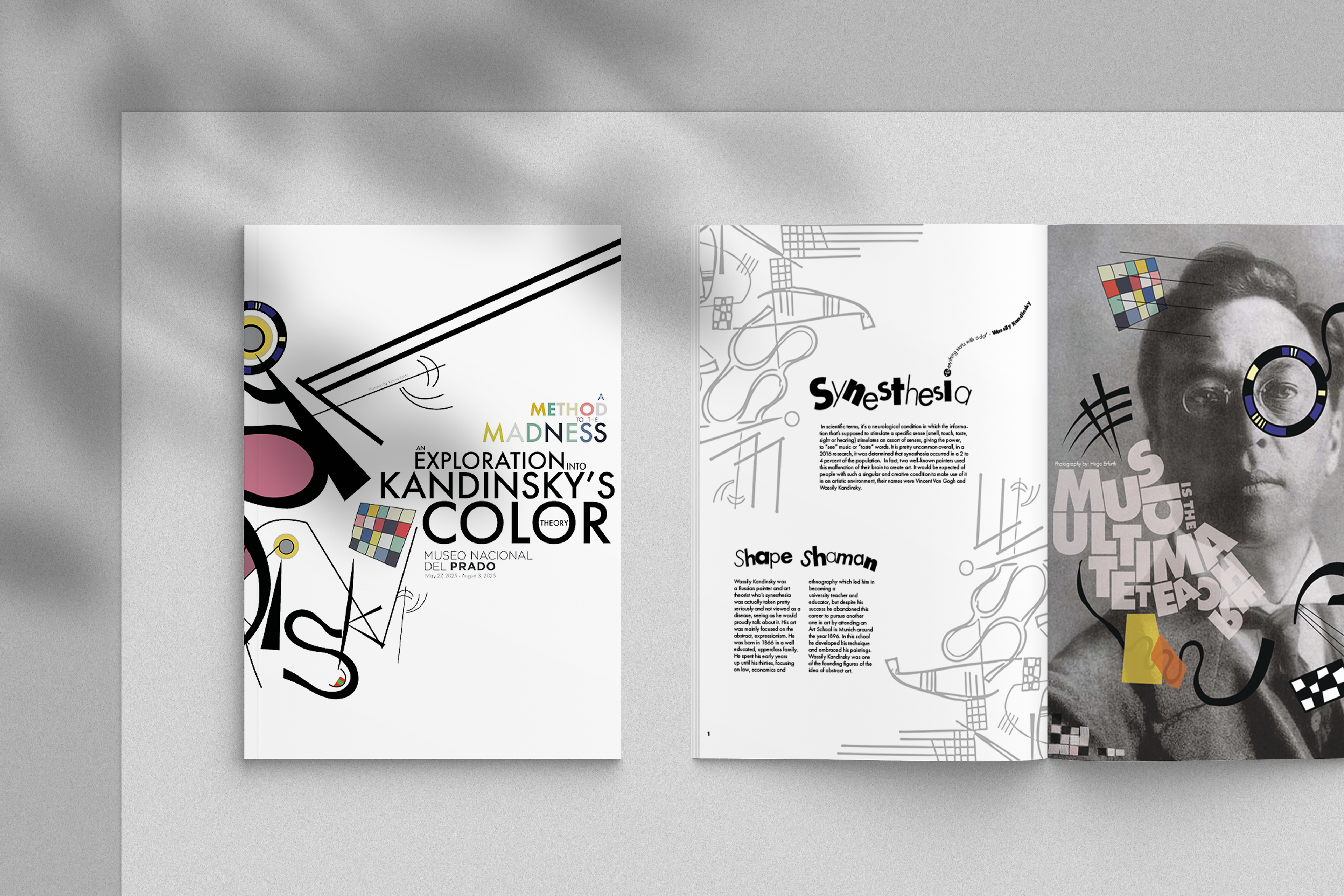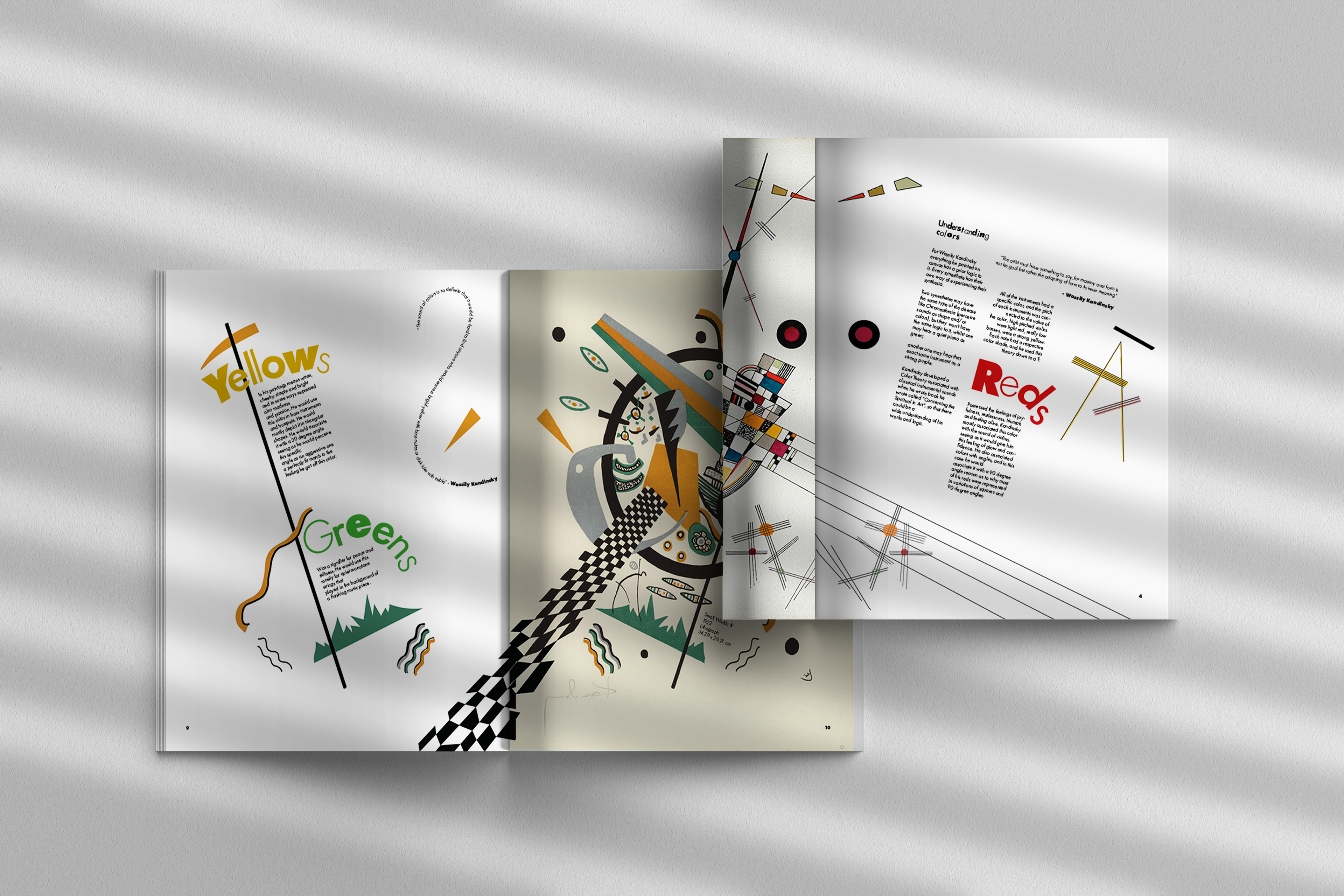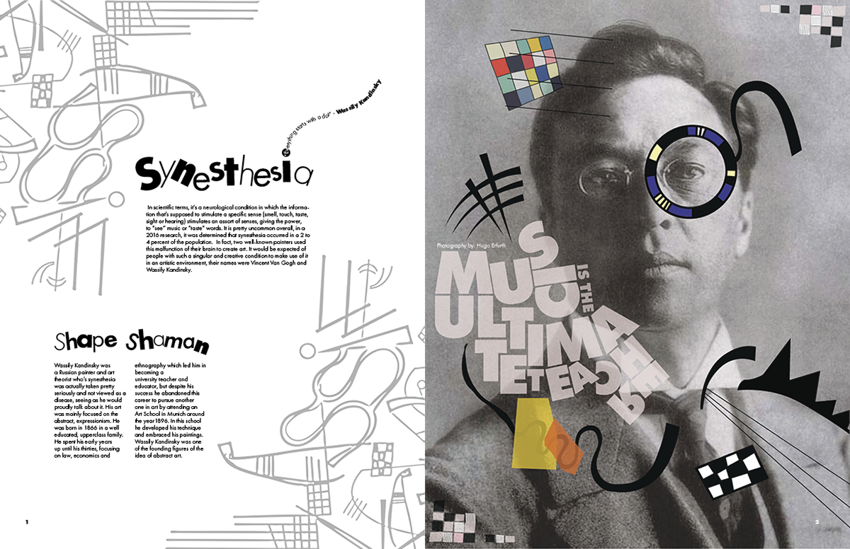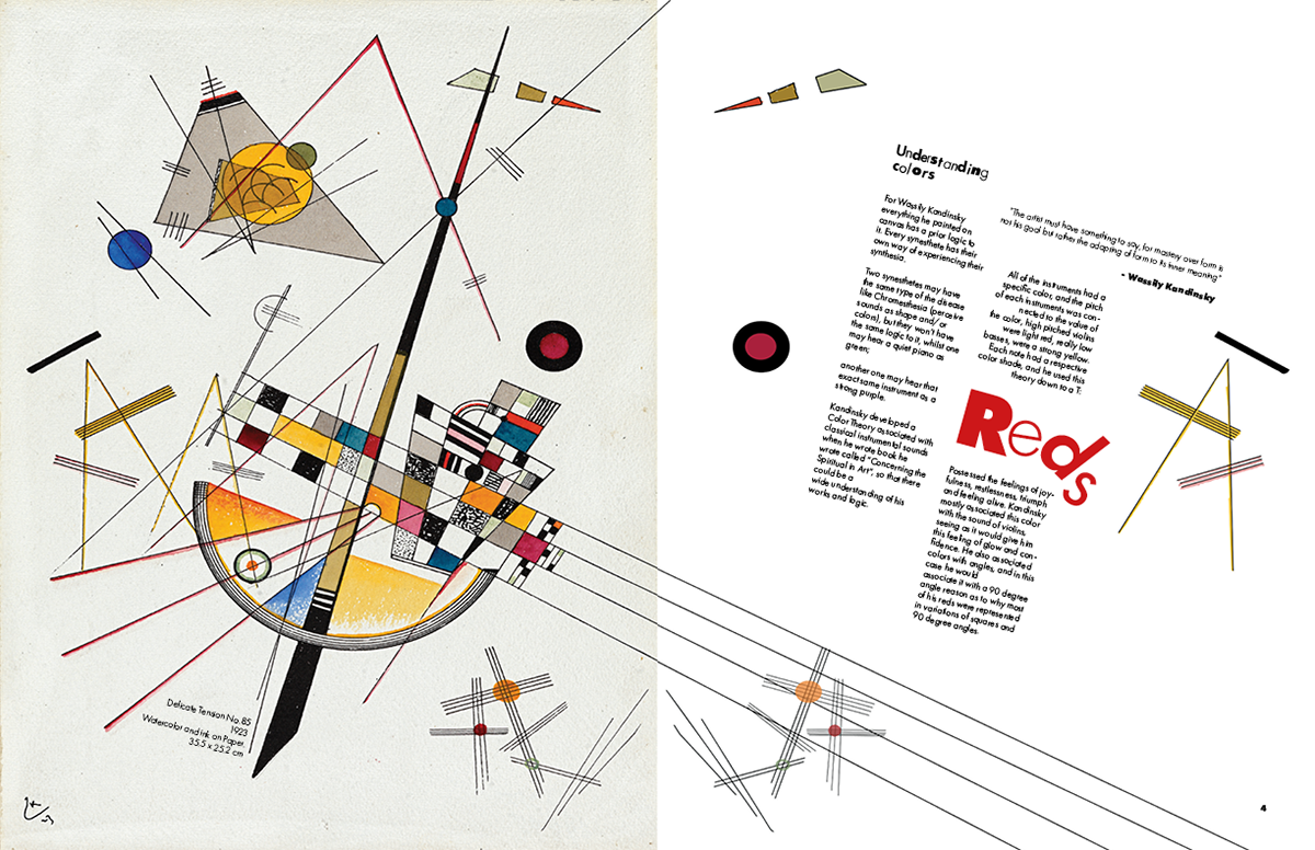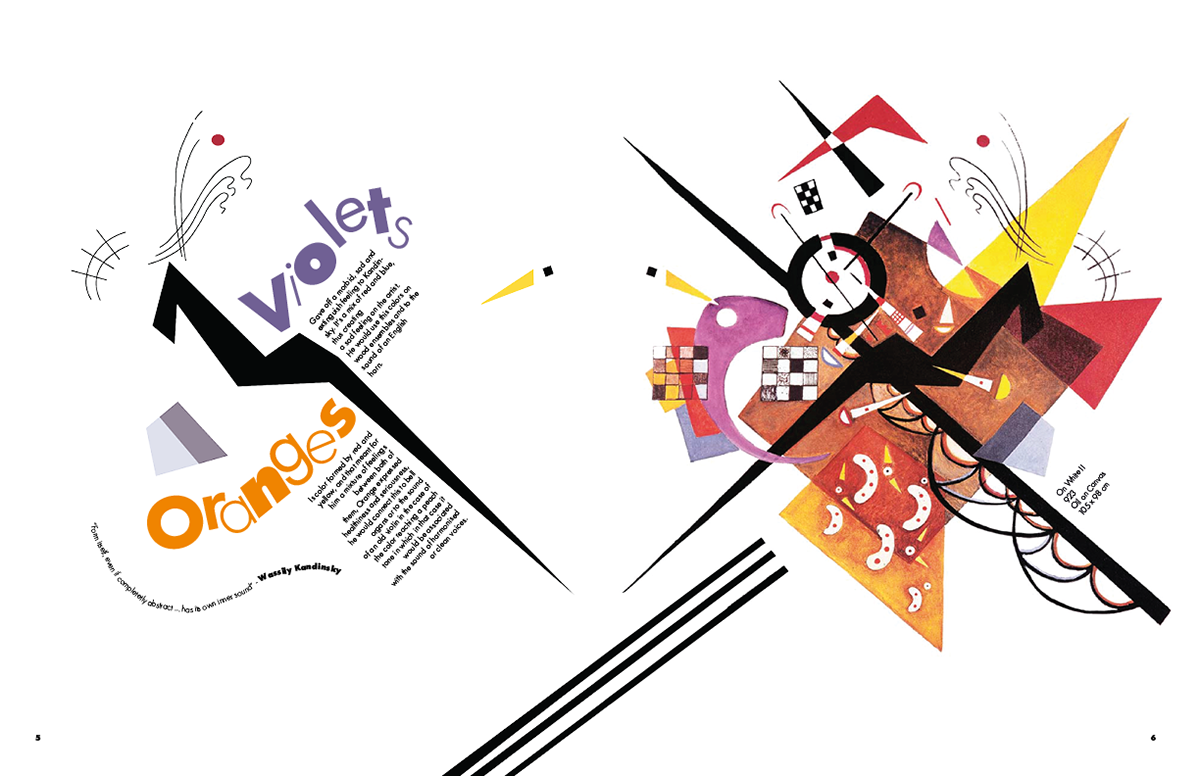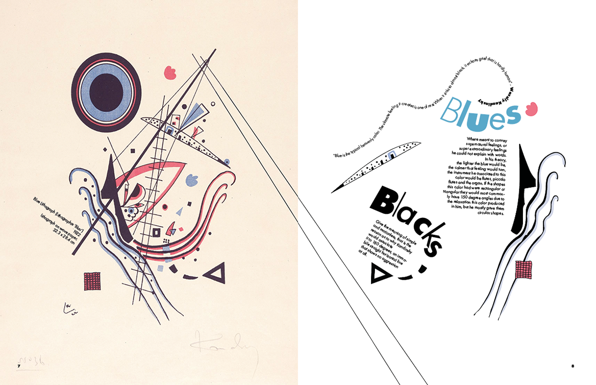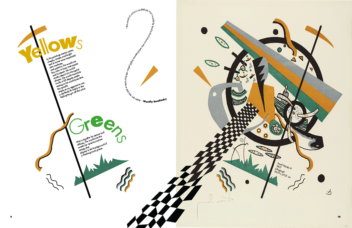

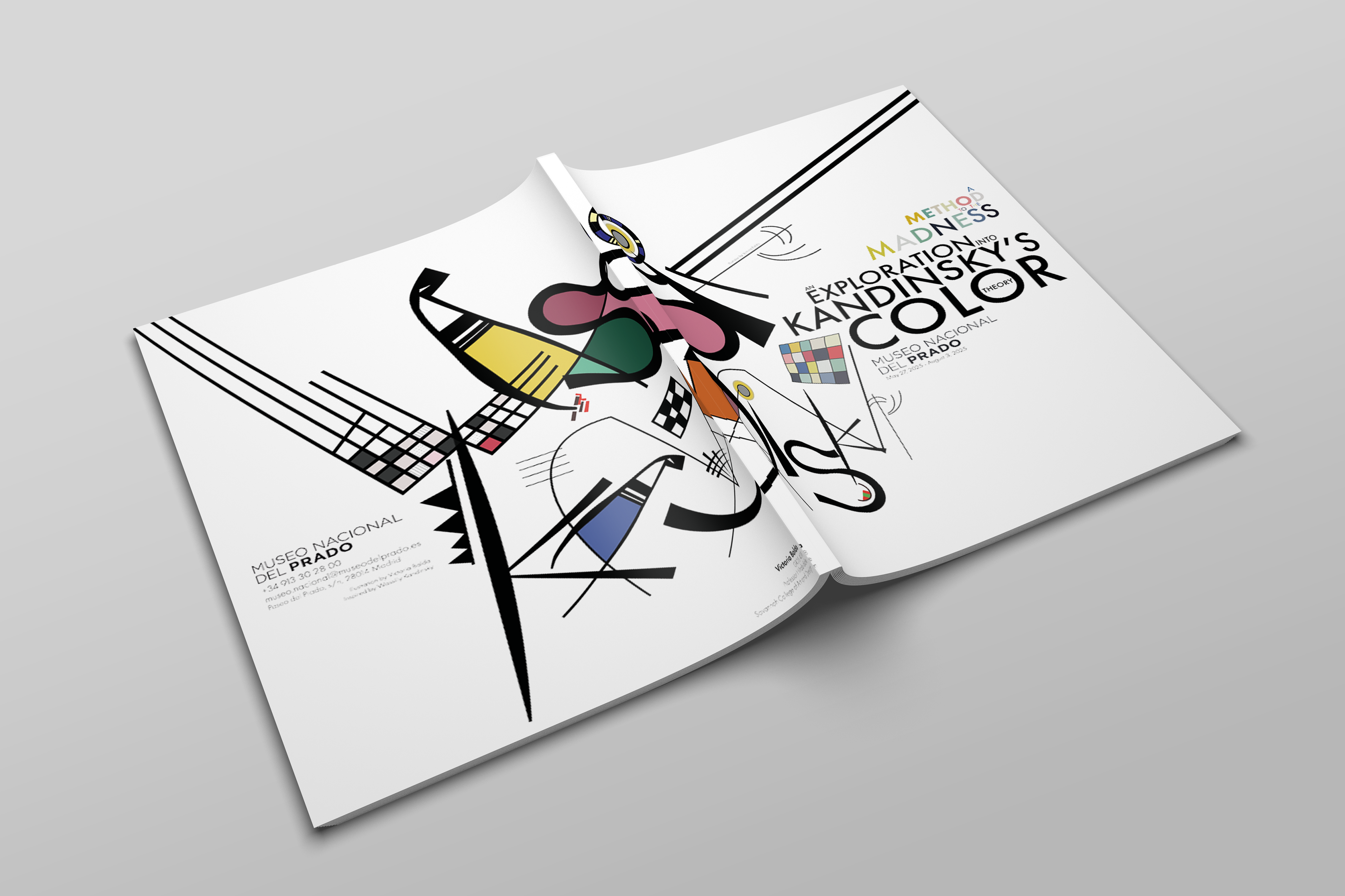
This brochure was designed for a hypothetical exhibition on Wassily Kandinsky’s color theory at the Museo Nacional del Prado. The visual language is constructed entirely from Kandinsky’s own formal vocabulary, those being lines, geometric motifs, textures, and chromatic accents extracted from his paintings. I created a custom display typeface for the introductory spread by deconstructing and recomposing letterforms found in his work, allowing the typography itself to echo his abstract syntax. Throughout the brochure, Kandinsky’s paintings intentionally break their boundaries and spill across spreads, reinforcing the idea of color as an energetic force rather than a contained element. Each section interprets a different aspect of his theory, integrating text with dynamically arranged fragments of his compositions to create a rhythm that mirrors the synesthetic, multisensory quality central to his practice.